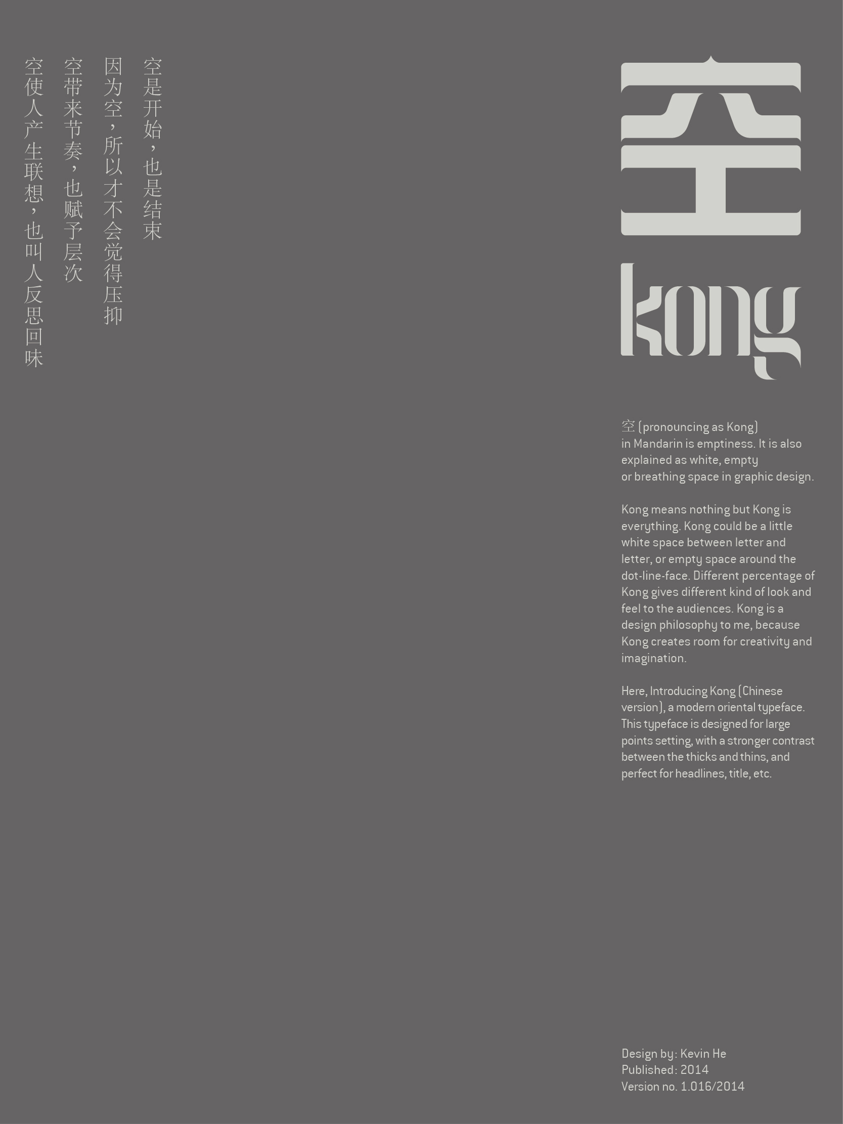
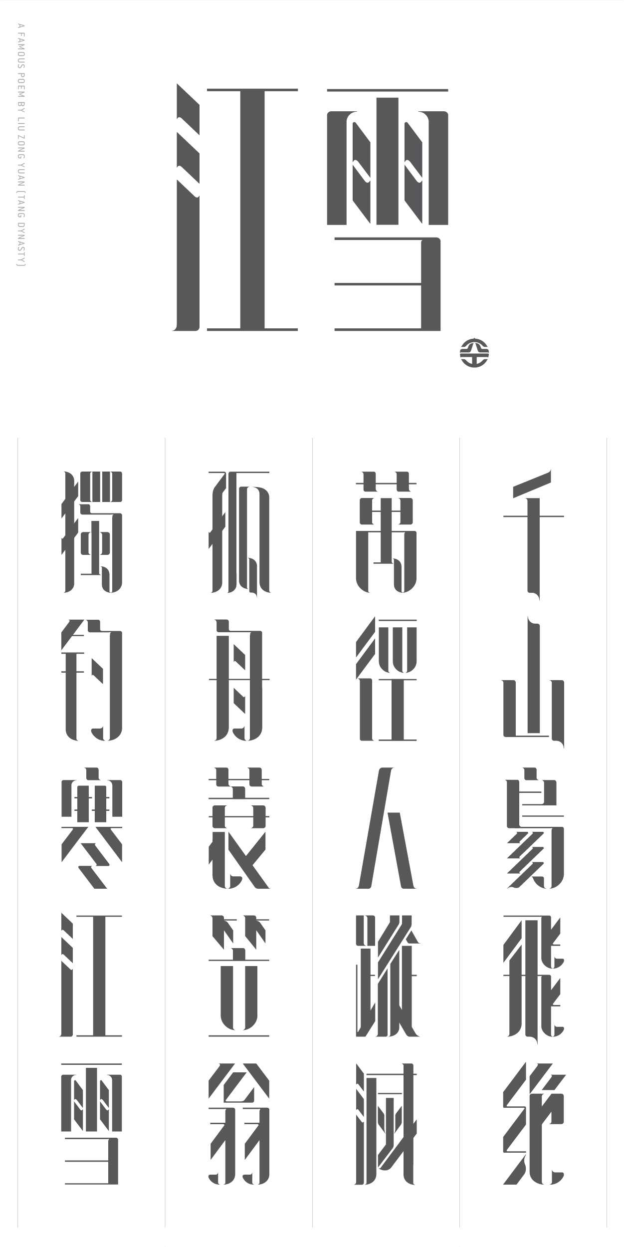
空 KONG (CHINESE TYPEFACE)
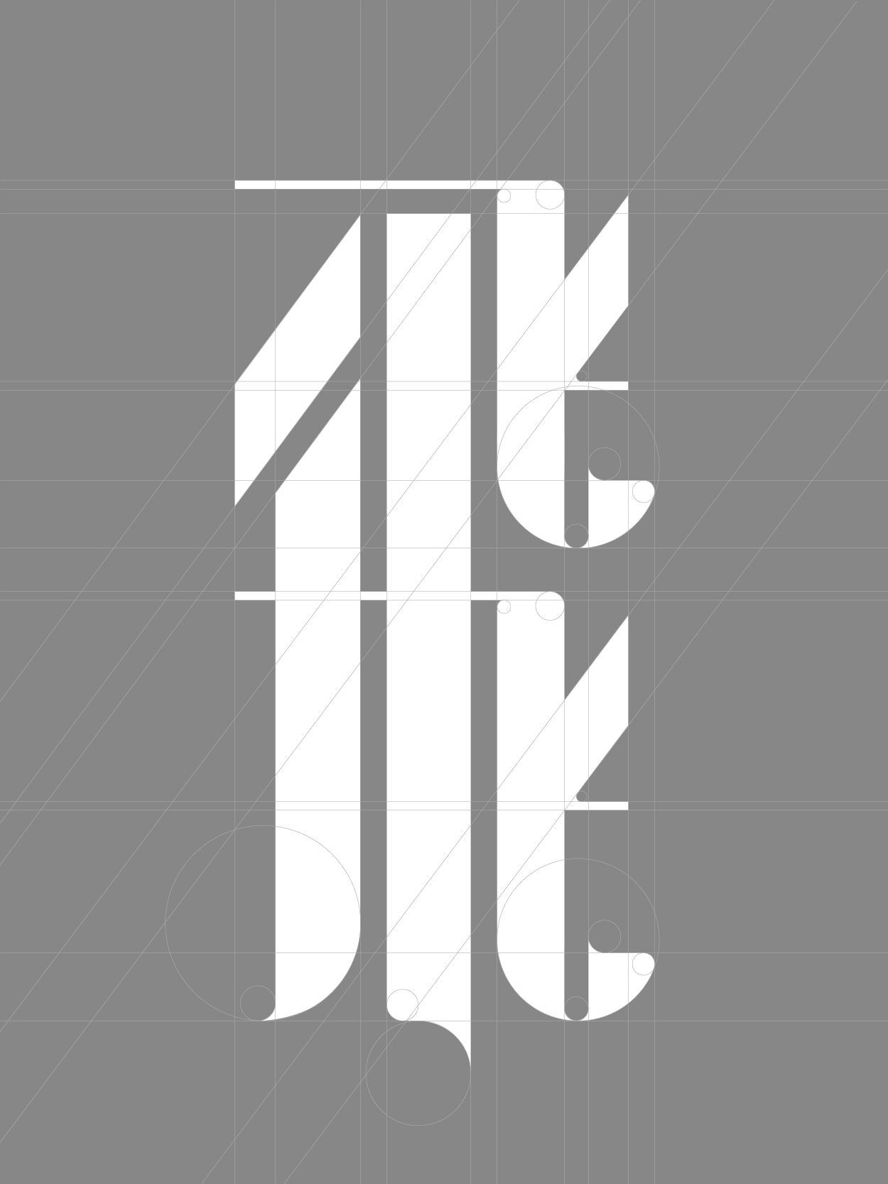
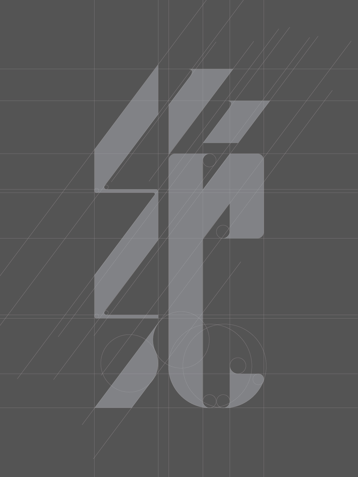
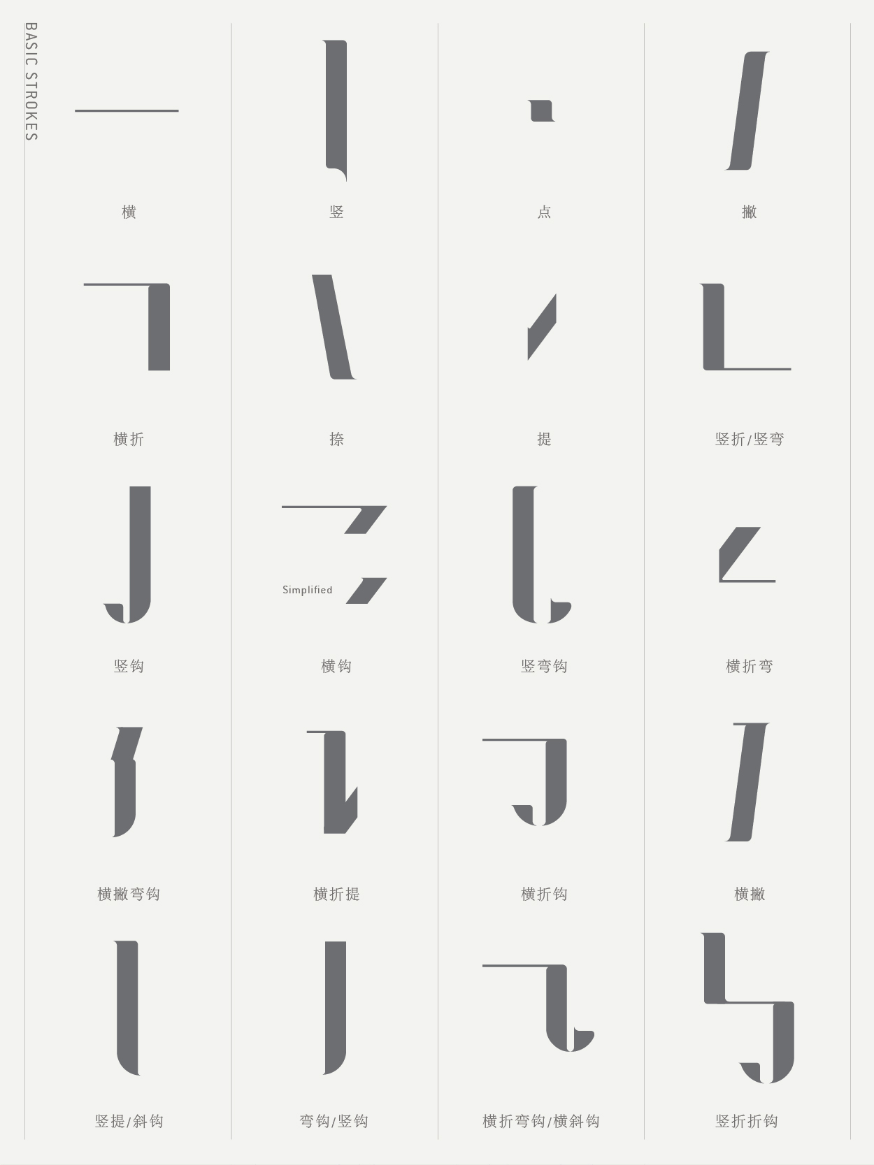
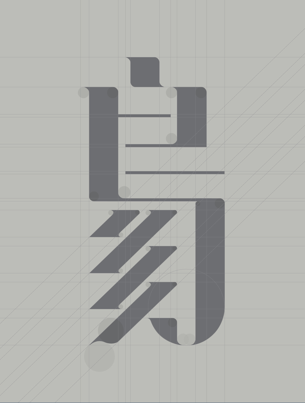
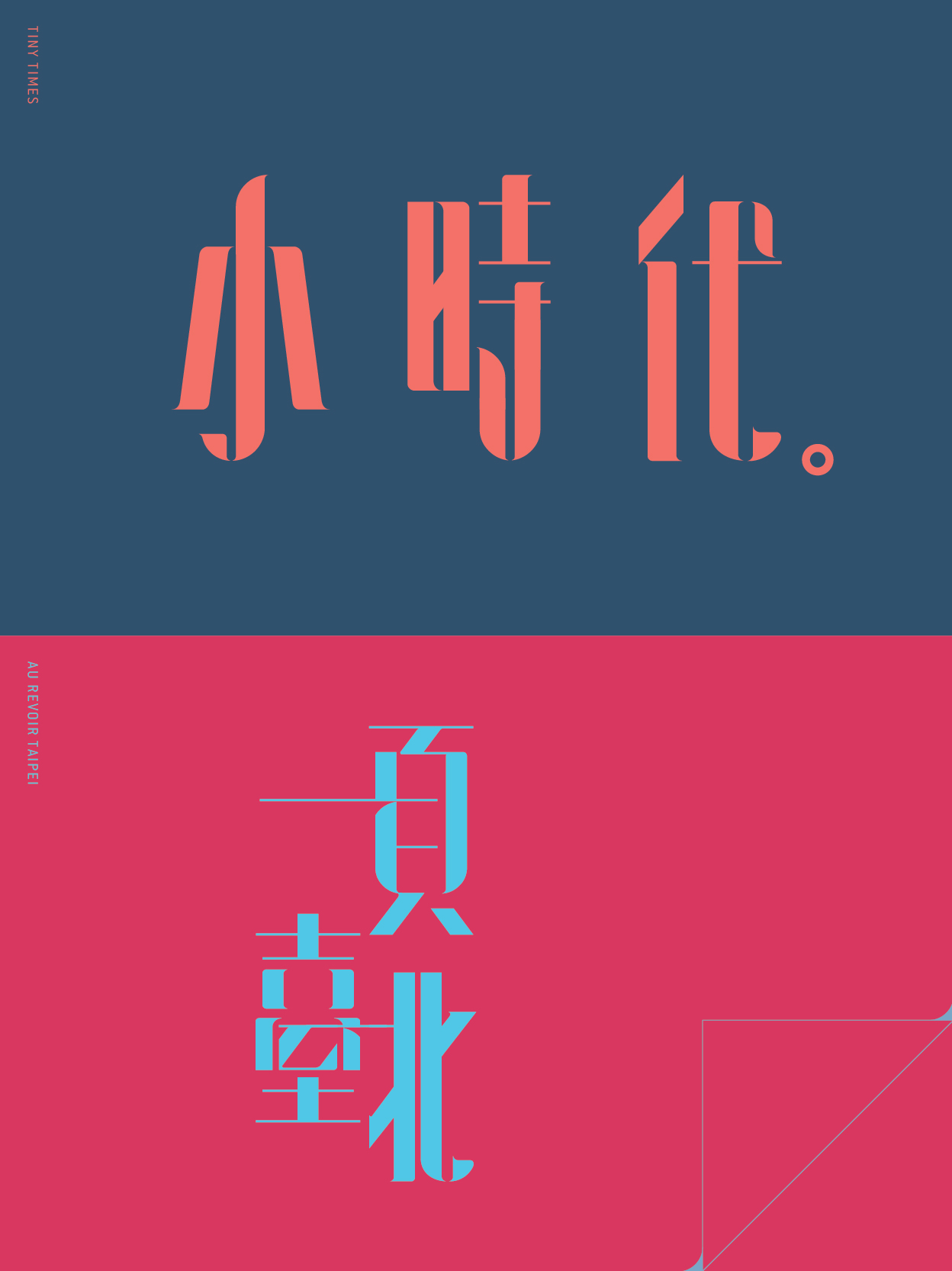
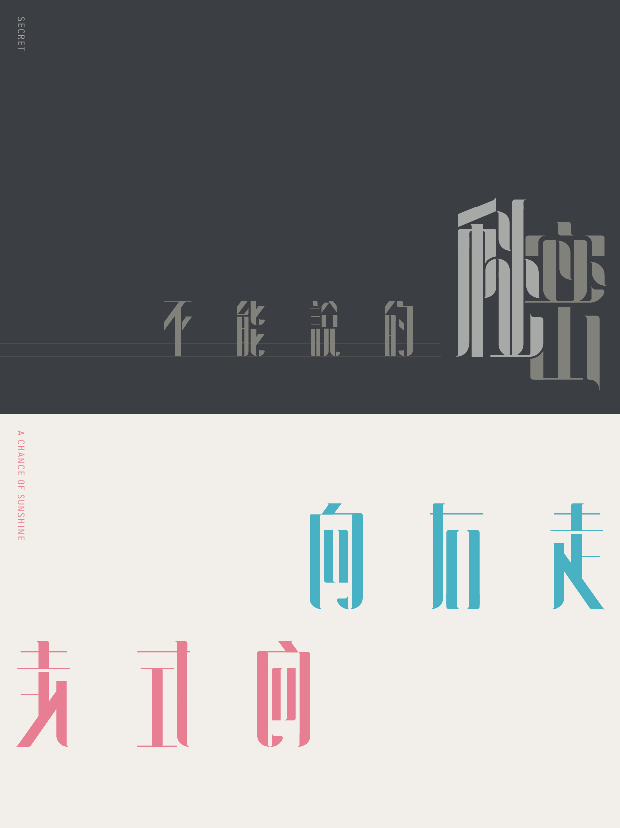
空 (pronouncing as Kong) in Mandarin is emptiness. It is also explained as white, empty or breathing space in graphic design. Kong means nothing but Kong is everything. Kong could be a little white space between letter and letter, or empty space around the dot-line-face. Different percentage of Kong gives different kind of look and feel to the audiences. Kong is a design philosophy to me, because Kong creates room for creativity and imagination. Here, Introducing Kong (Chinese version), a modern oriental typeface. This typeface is designed for large points setting, with a stronger contrast between the thicks and thins, and perfect for headlines, title, etc.
Thanks for watching.
Please click the link below if you want to see the English version of [kong] typeface.