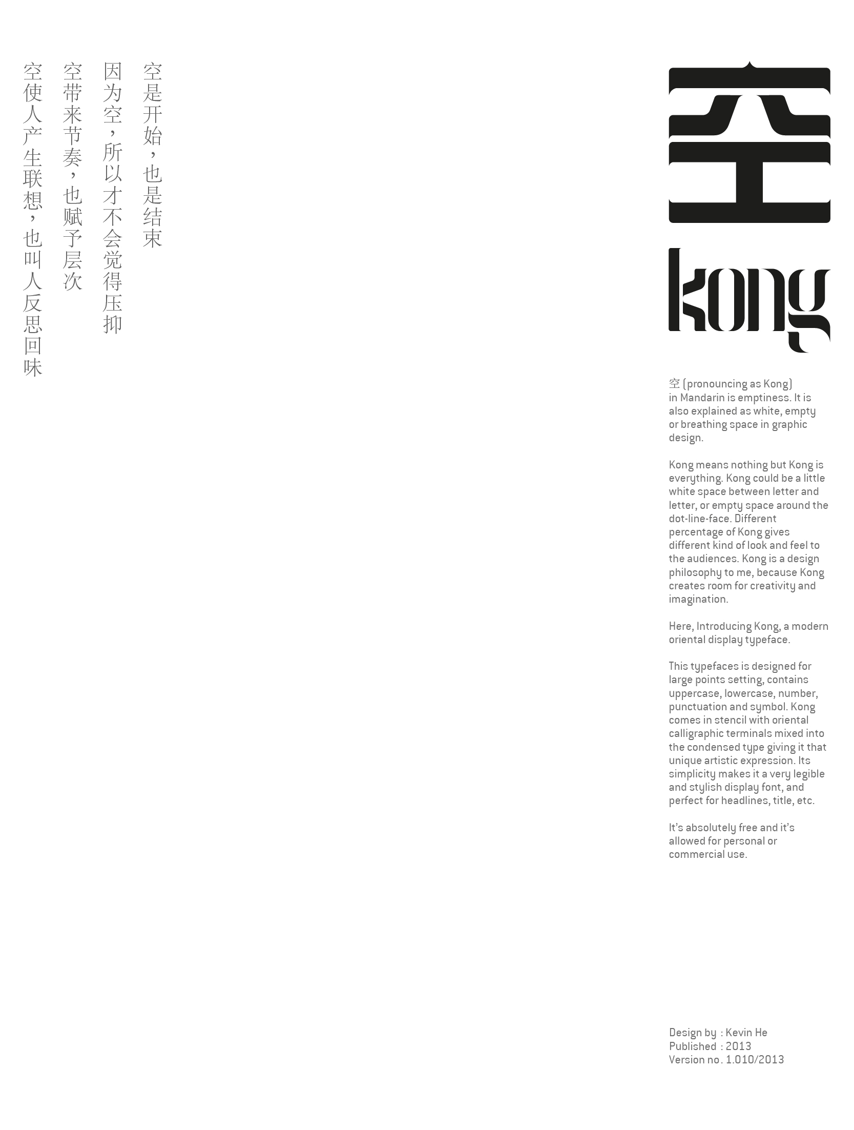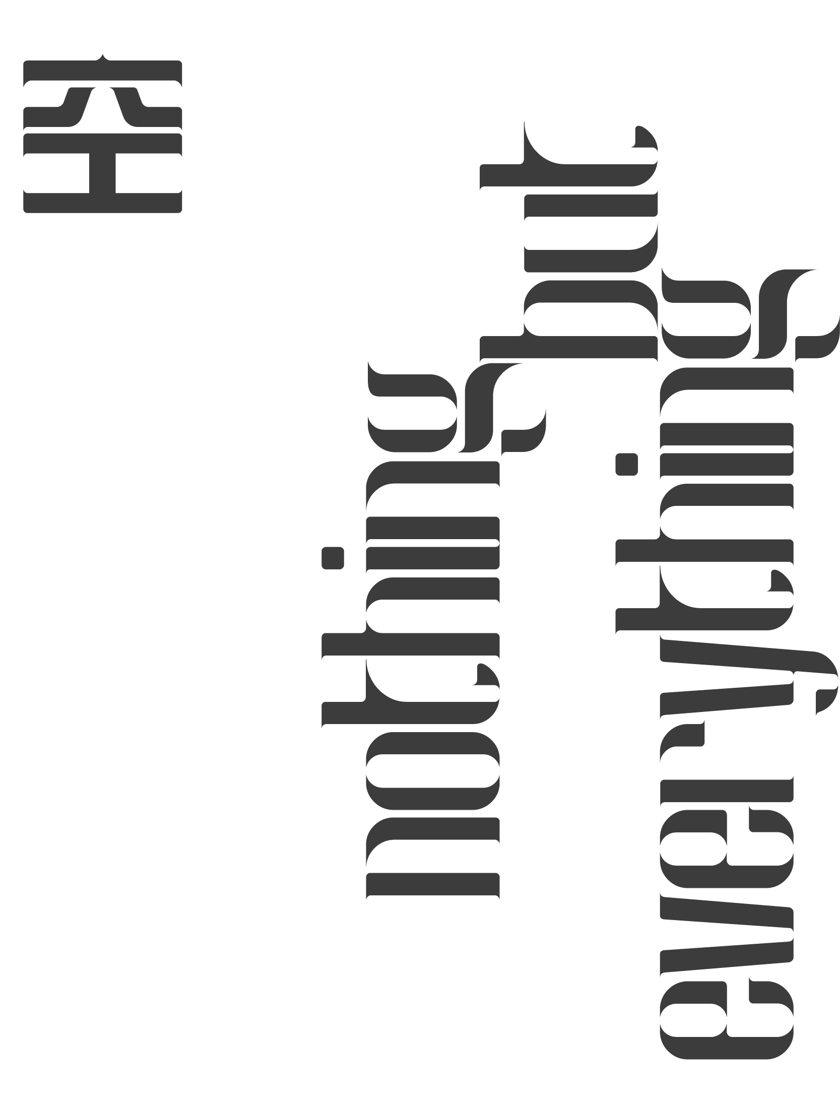
空 KONG TYPEFACE
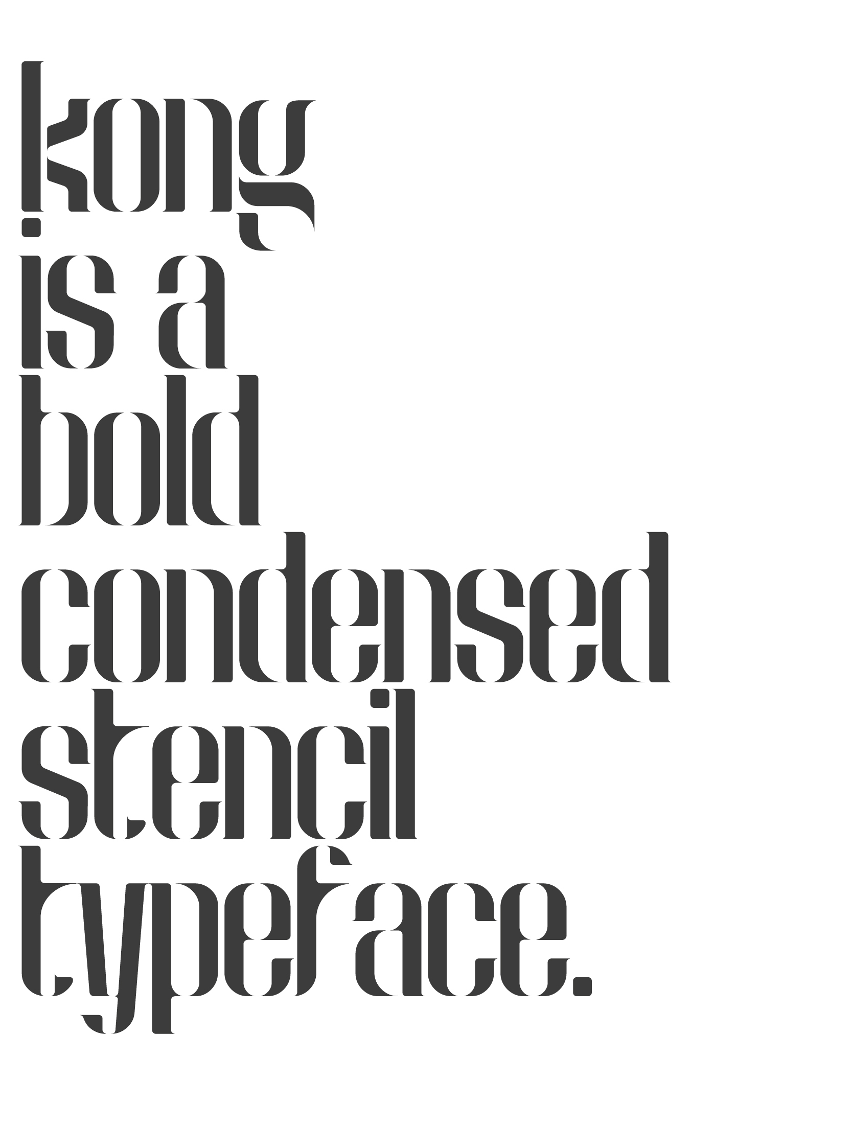
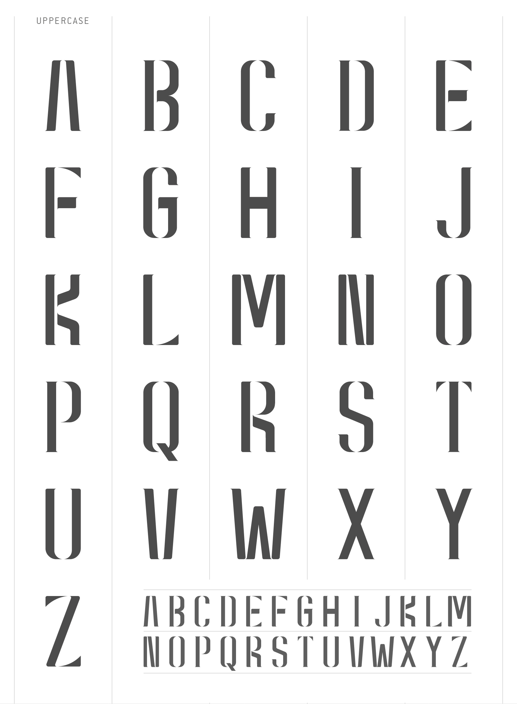
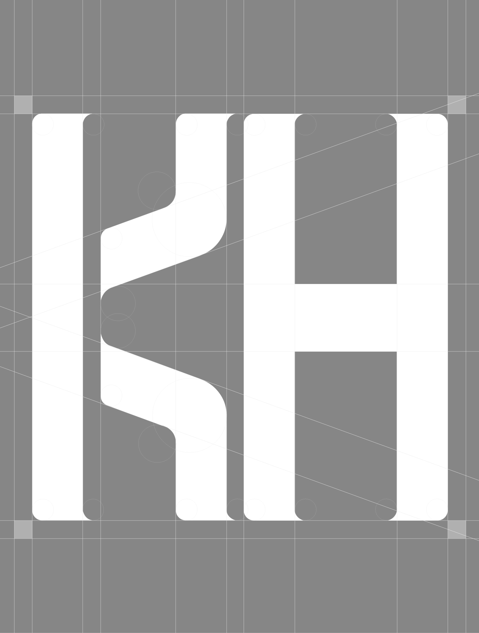
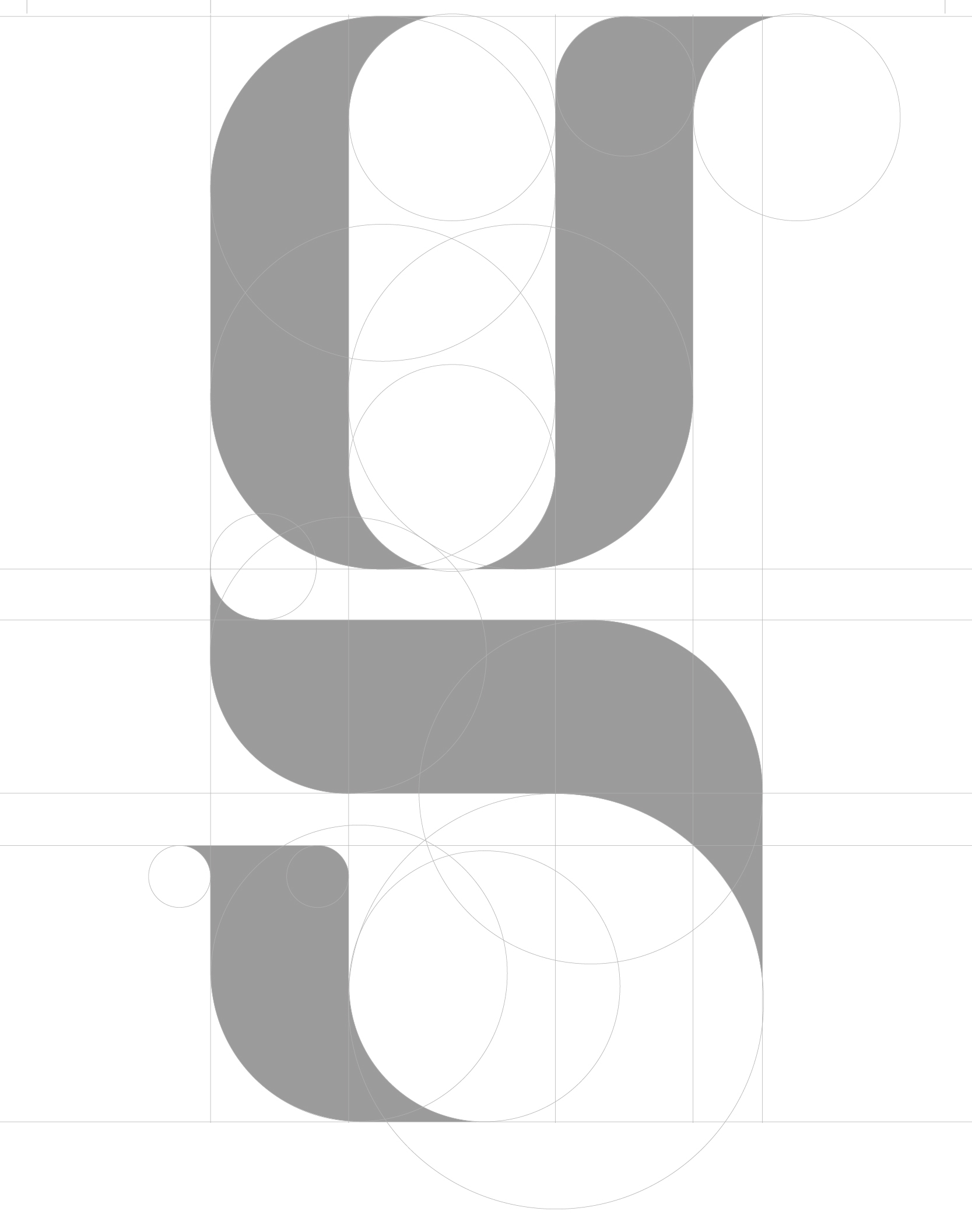
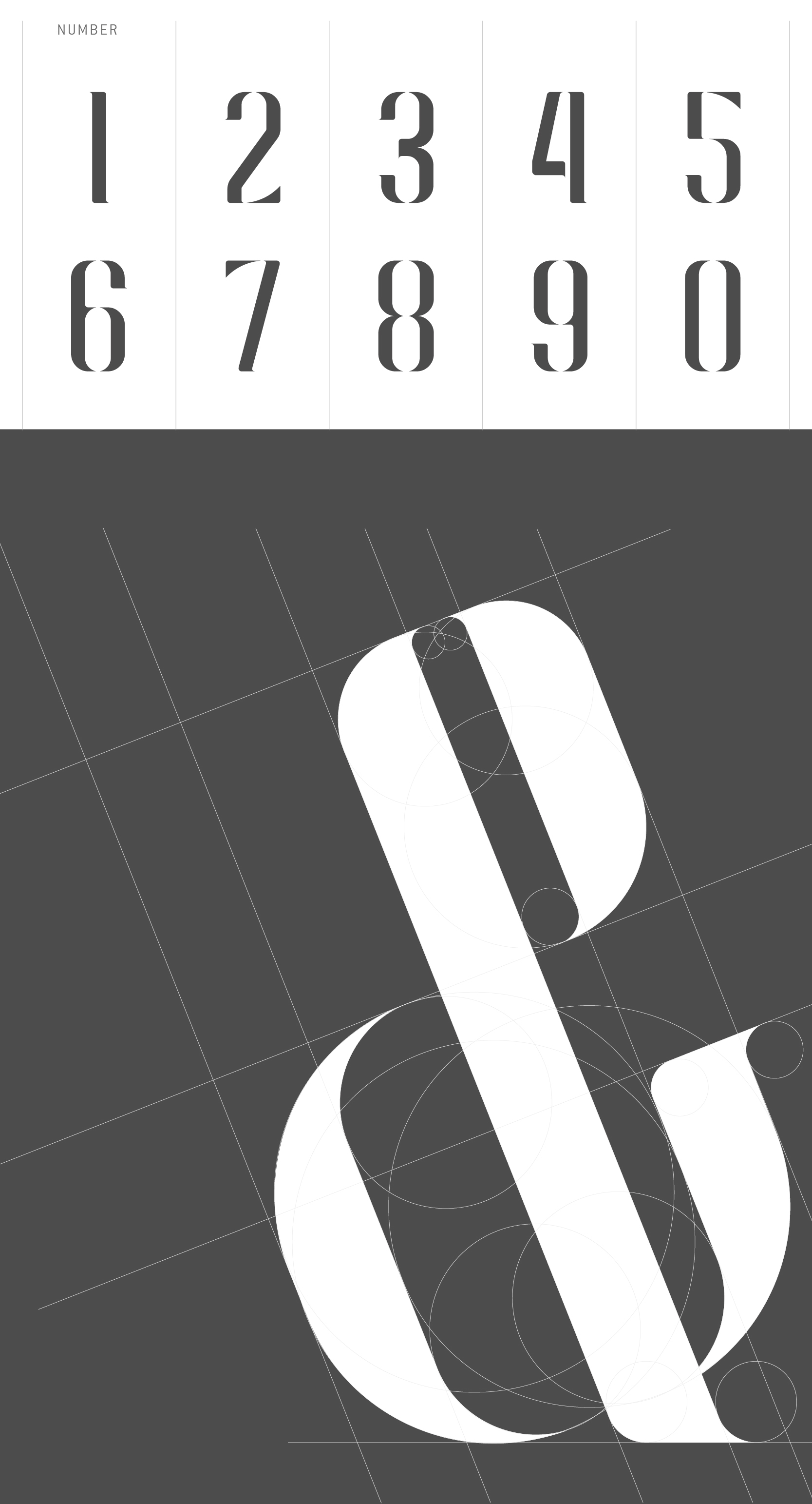
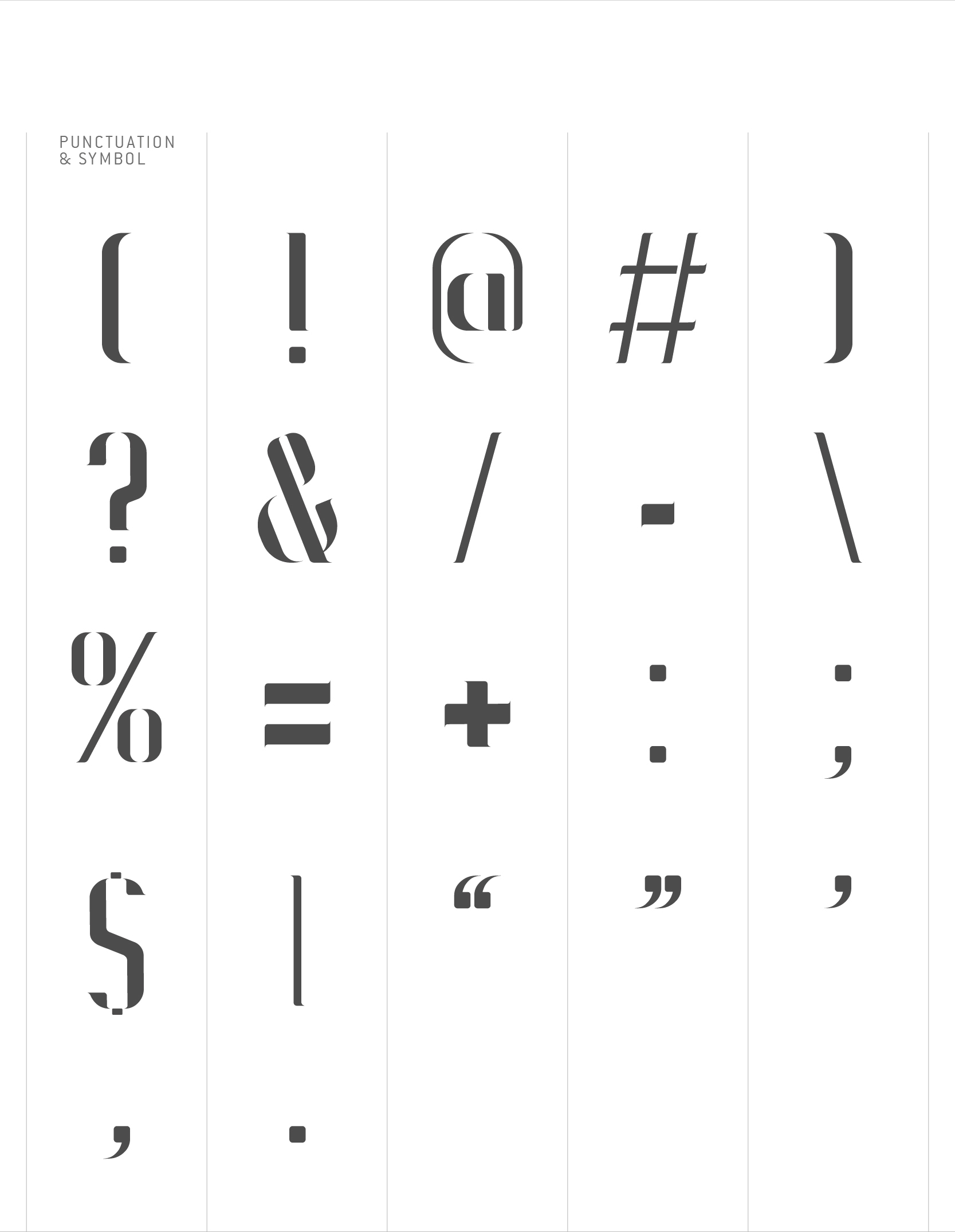
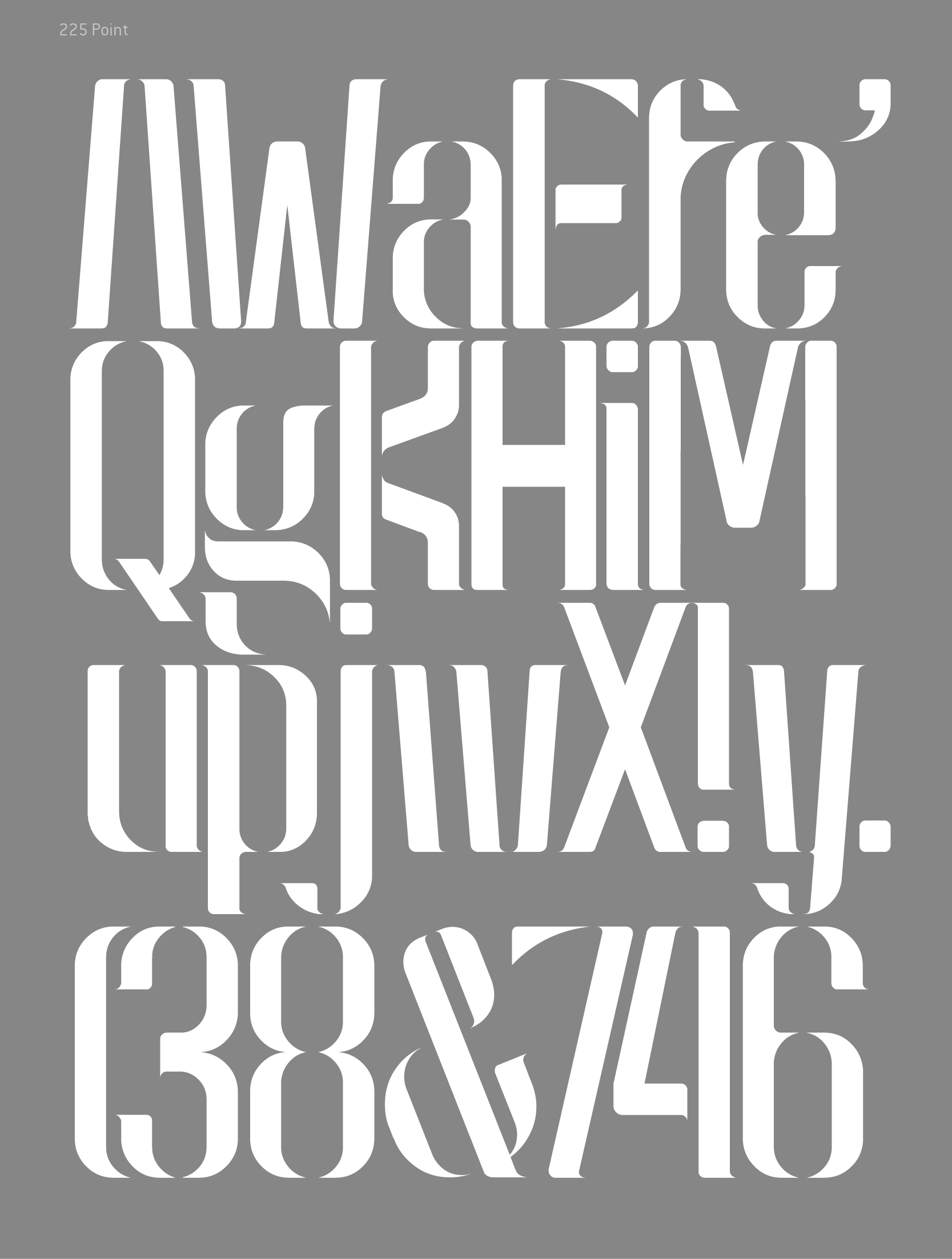
空 (pronouncing as Kong) in Mandarin is emptiness. It is also explained as white, empty or breathing space in graphic design. Kong means nothing but Kong is everything. Kong could be a little white space between letter and letter, or empty space around the dot-line-face. Different percentage of Kong gives different kind of look and feel to the audiences. Kong is a design philosophy to me, because Kong creates room for creativity and imagination. Here, Introducing Kong, a modern oriental display typeface. This typefaces is designed for large points setting, contains uppercase, lowercase, number, punctuation and symbol. Kong comes in stencil with oriental calligraphic terminals mixed into the condensed type giving it that unique artistic expression. Its simplicity makes it a very legible and stylish display font, and perfect for headlines, title, etc. It’s absolutely free and it’s allowed for personal or commercial use.